Bar chart widget
Configuring Bar chart widget
To configure Bar chart widget do the following:
-
From the right side of the widget generation page, click the Update Widget Column Configurations icon.
-
Configure any of the following:
| Items | Description |
|---|---|
| X-Axis | Click the field to change the title of the X-Axis. |
| Y-Axis | Click the field and specify the following:
|
| Slice with color | Contains the column data which is color coded and presented. You drag and drop items in this section from Not Visualized section to visualize corresponding data. |
| Not Visualized | Drag and drop items in this section into the Slice with color section to view corresponding data in the canvas region. |
info
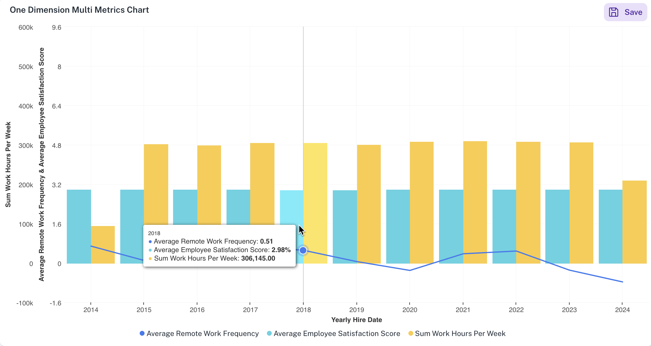
DataGOL supports plotting multiple metrics (Y-axis) against a single dimension (X-axis).
For example: As shown in the image, for a single dimension such as Yearly Hire Date on the X-axis, our system can display multiple metrics such as Average Remote Work Frequency, Average Employee Satisfaction score and Sum work hours per week on the Y-axis. This would visualize a combination chart of bars and line.
Setting Bar chart widget
To set the Bar chart widget, do the following:
-
From the right side of the widget generation page, click the Update settings icon.
-
Set the following:
Item Description General Set general details. Title Edit the title of the chart. Subtitle Edit the subtitle of the chart. Help message Type the message that appears when you hover over the help icon. Display Set the display details of the displayed Bar chart widget. X-Axis Grid Lines Check this option to view the X-Axis grid lines. Y-Axis Grid Lines Check this option to view the Y-Axis grid lines. Horizontal Check this option to view the bars in the chart horizontally. Stacked Select this option to view data in a stacked format. This is useful for visualizing how a total quantity is distributed among different categories. Also specify if you want to view the values in regular format or in percentage. Tooltip C heck this option for the chart tooltip and choose either to share all values in a single tooltip, or show each point's value separately. Linked reports Set the details of the dashboard reports you want to view from this widget. Linked report URL Paste the URL of the dashboard that you want to view from this widget. Open in New tab Specify if you want to view the linked report in a different tab.
Was this helpful?